
ART DIRECTION / LOGO / 3D
011 / ATUX TD / IDENTITY
INTRO
I have been creating different projects since 2016. During this time I have studied references from different fields (there are definitely more than 60K images selected so far), learned many technical skills from various areas, as well as worked with different international companies and created projects beyond digital
This massive experience allows me to translate my vision precisely to whatever the creation task may be (packaging, design, filming, website, etc). The main goal I set for myself is to achieve maximum authenticity in creation and quality in production




NAMING
My search for a name began by writing out all the words that resonated with my inner feeling of the brand. After that, I also did a similar research for images, keeping the ones that fit best. Then, a lot of time was spent studying all the different synonyms of the words that were written out, as well as analyzing the similarities between the selected images. However, none of what was found could be entirely identical to my feeling. This led me to the realization that a brand name can only be a new invented word
The criteria for the word were:
- small number of letters
- strong pronunciation
- the word does not sound similar to existing words, so that there are no associations with other images
- it will be easy to create a domain and a social media account
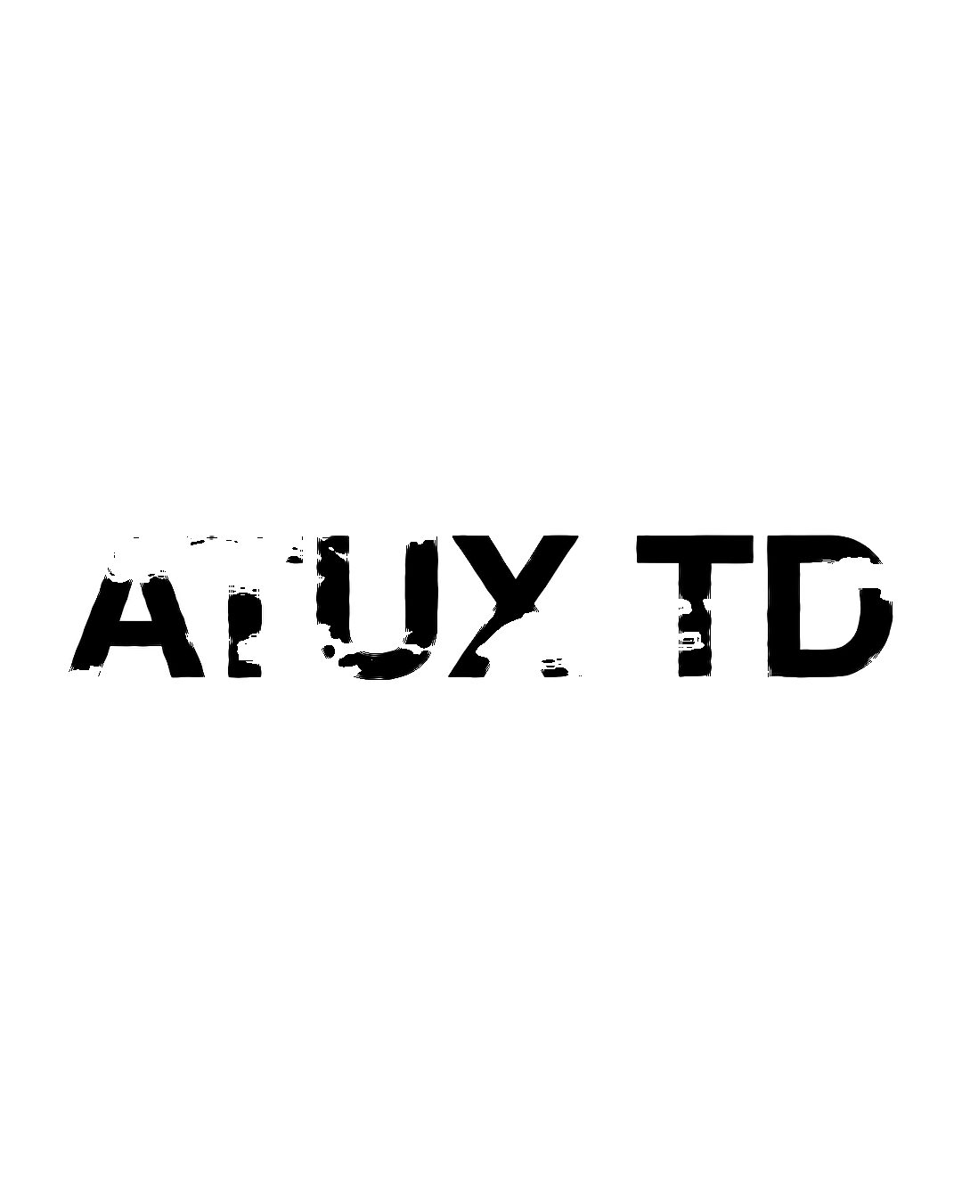
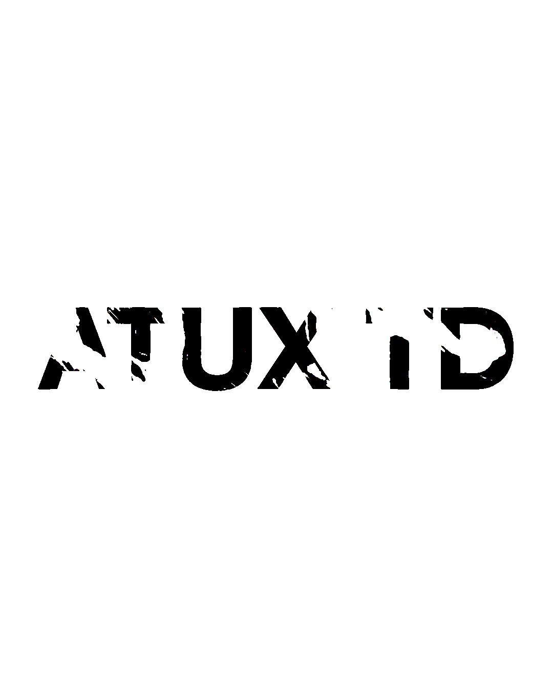
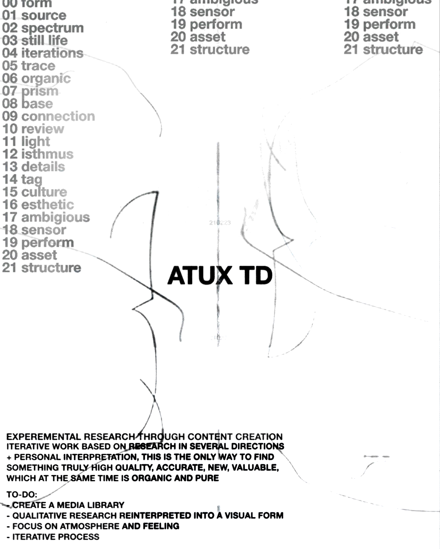
In the process of searching, I studied which existing sounds resonate more with my senses. It got to the point where I was additionally studying ancient Egyptian and Roman names. In the course of many variations between a selection of sounds, simple letters of the alphabet whose writing was graphically closer to me, the name ATUX was formed. To myself, I describe ATUX as the highest iteration of my resonance with something / feeling when an object gives a sense of understanding you through its geometry, materials, concept and so on
P2S01
/23
02
P2S02
/23
02
ITERATIONS
SYMBOL
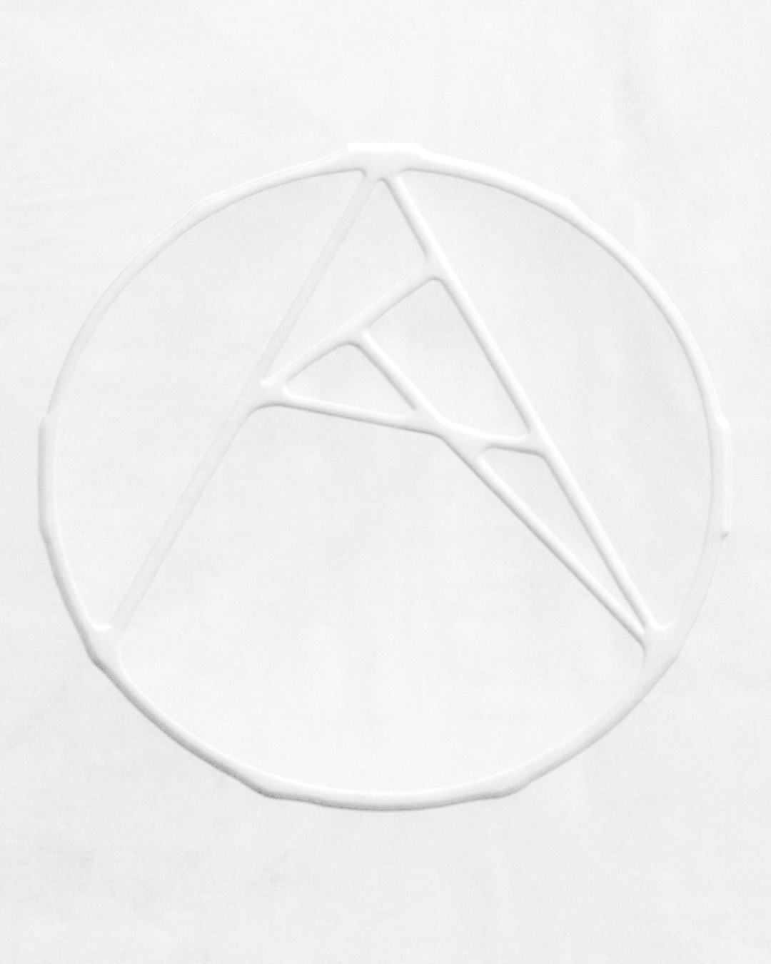
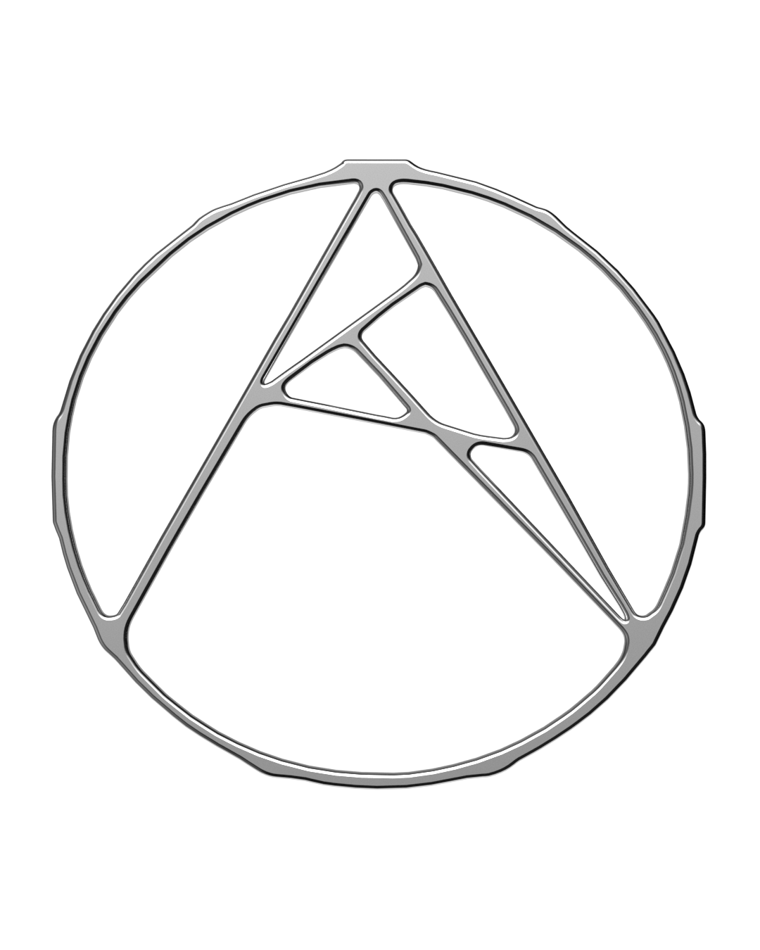
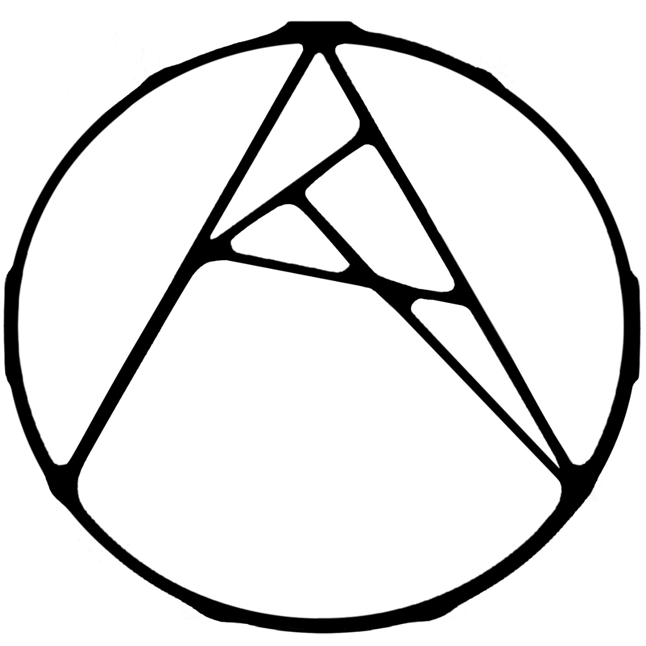
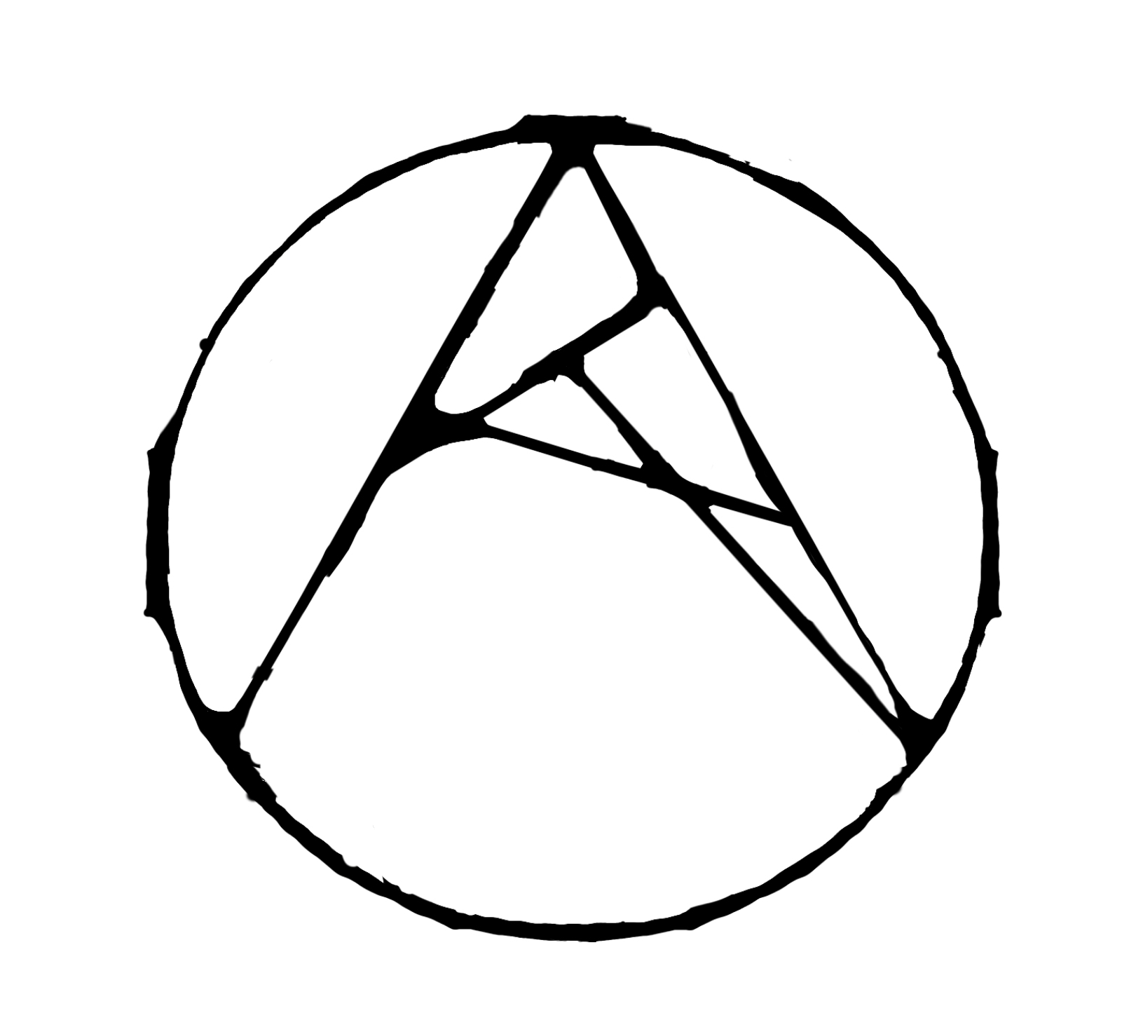
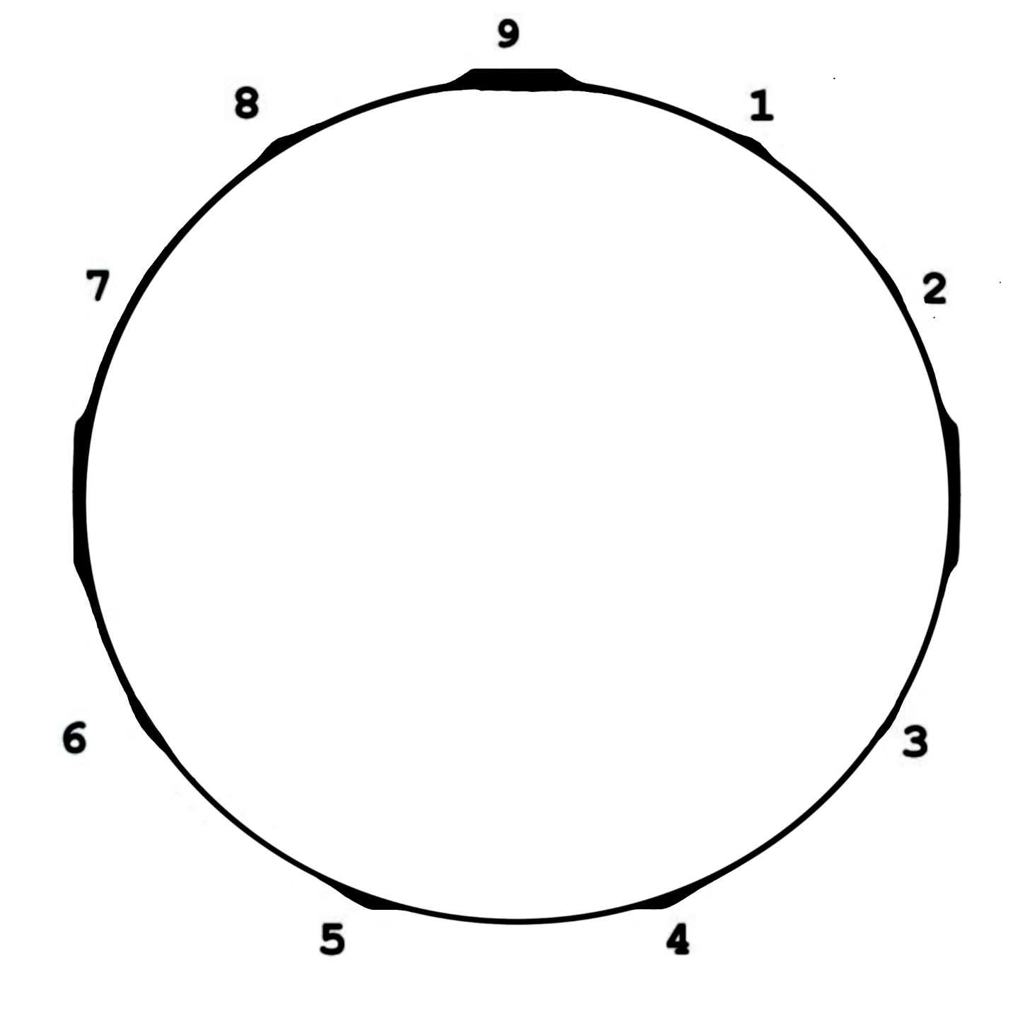
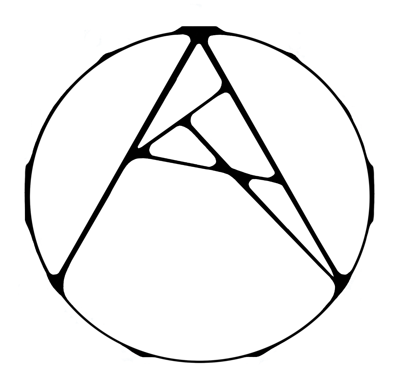
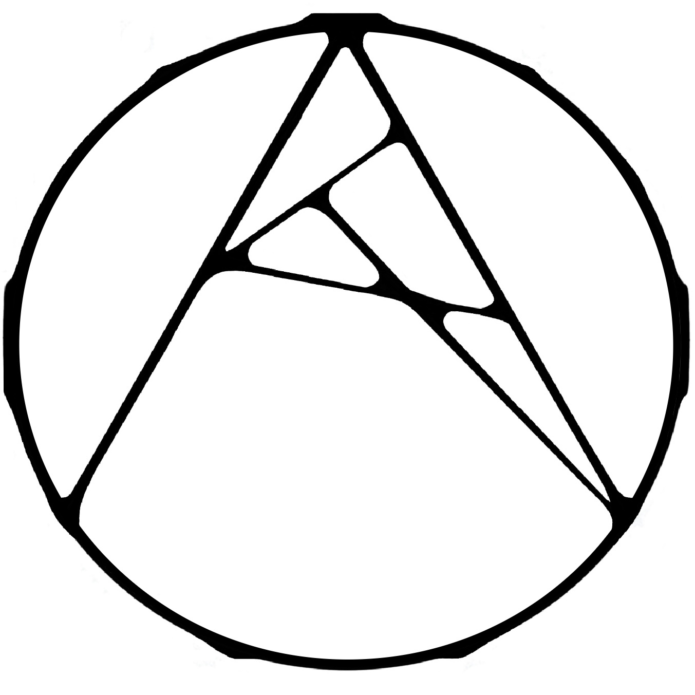
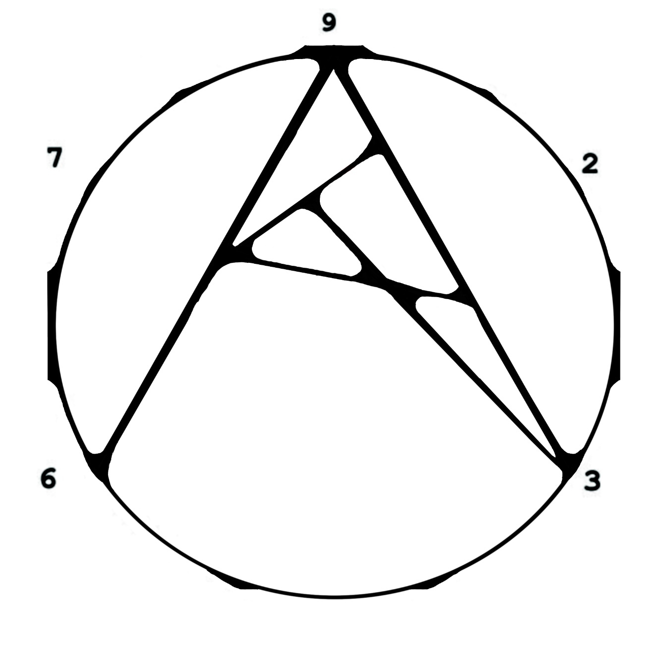
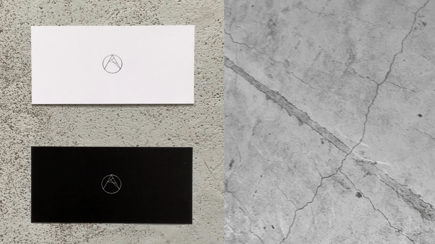
This symbol stands for the research of items created by the brand. For me the documentation of the object at all stages of its creation, from the first 3D renders of the concept to its final appearance, is critically important. The iterative creation of the media object that is in development allows me to understand/feel more about it myself and make it so much better
For this reason, the letter A is made of a series of organic intersections that form its overall shape, while the intersections are also exist around the letter itself. Which is a representation of the iterative process of the object's formation, where each stage of the object, its interaction with itself and with the environment is analysed to create the next stage of its development
For this reason, the letter A is made of a series of organic intersections that form its overall shape, while the intersections are also exist around the letter itself. Which is a representation of the iterative process of the object's formation, where each stage of the object, its interaction with itself and with the environment is analysed to create the next stage of its development
/23
02
P3S01


P3S02
03
/24
Credits:
Art Direction + CG: Tonya Drozdova
Art Direction + CG: Tonya Drozdova
ATUX TD
Feb 2023
Feb 2023