
01
/23
10
015 / CHOI
ART DIRECTION / LOGO
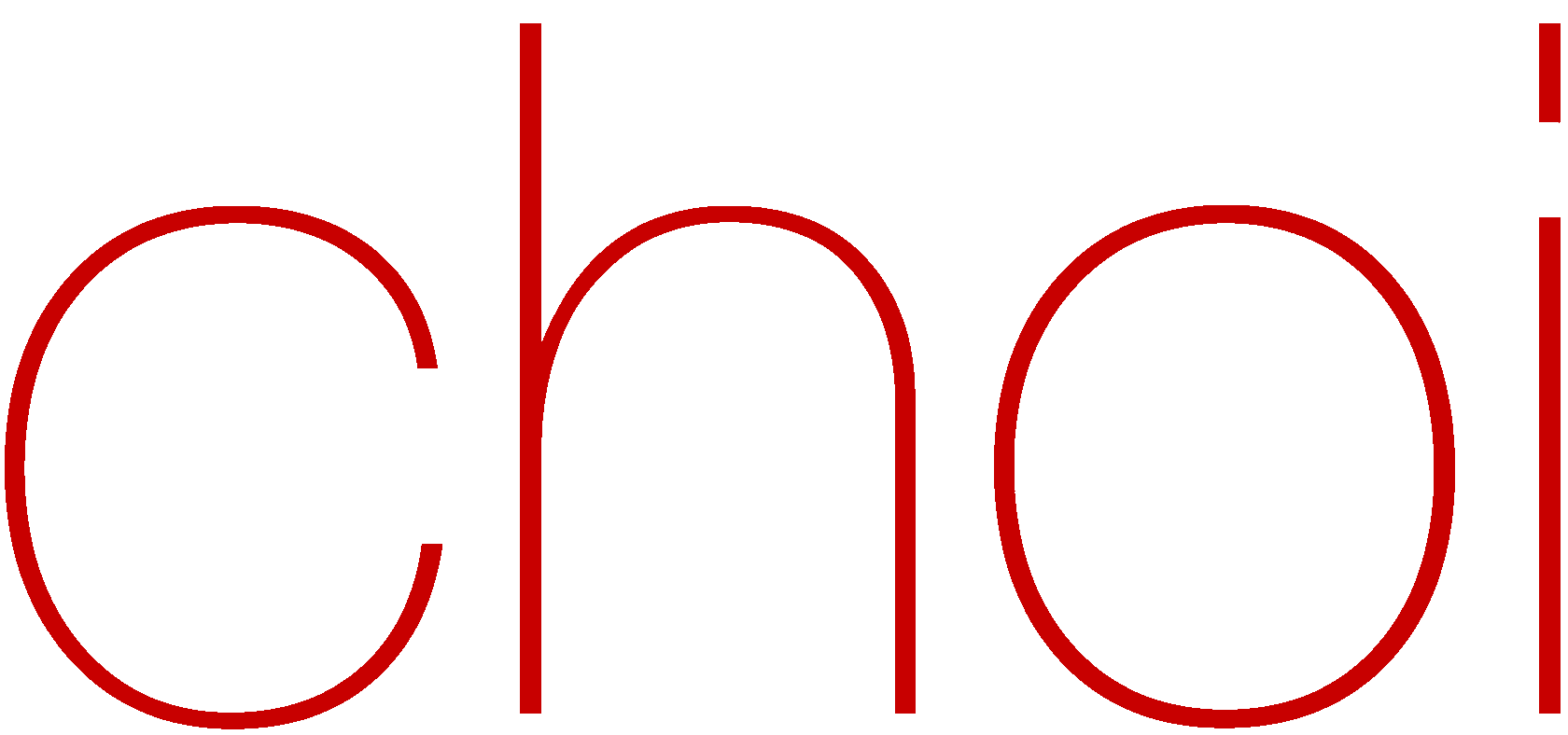
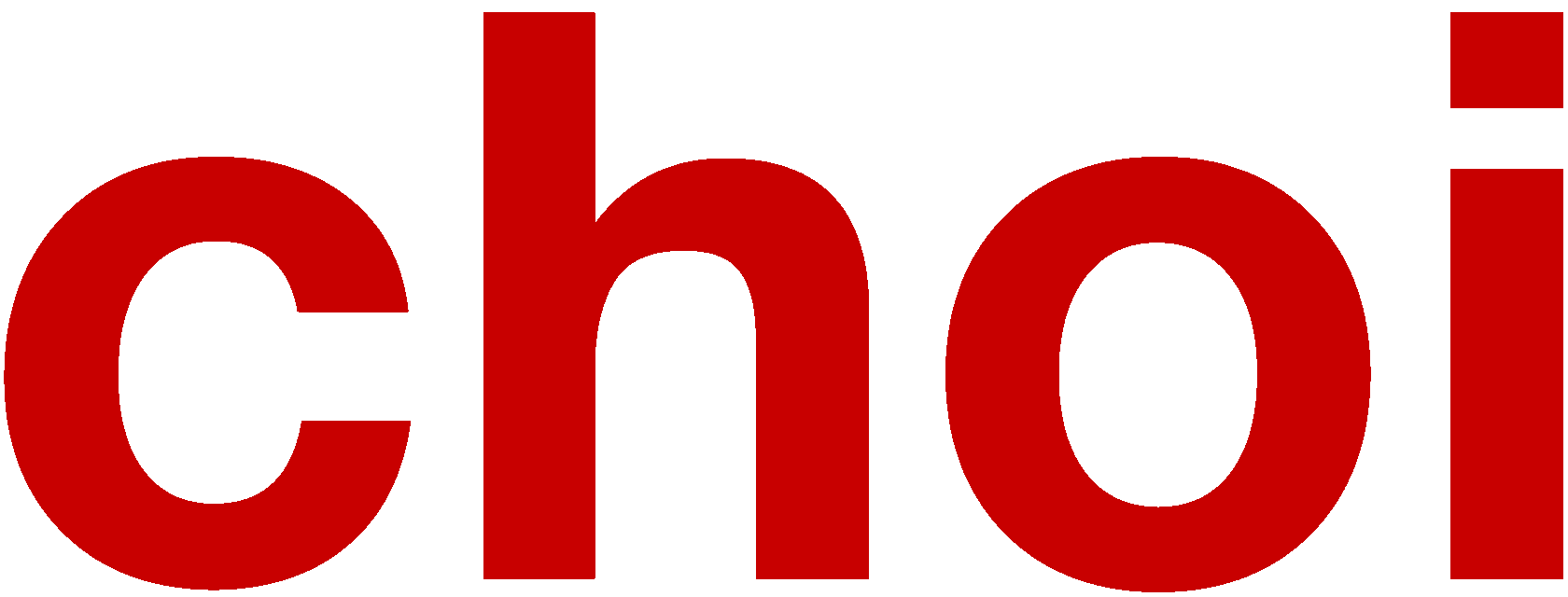
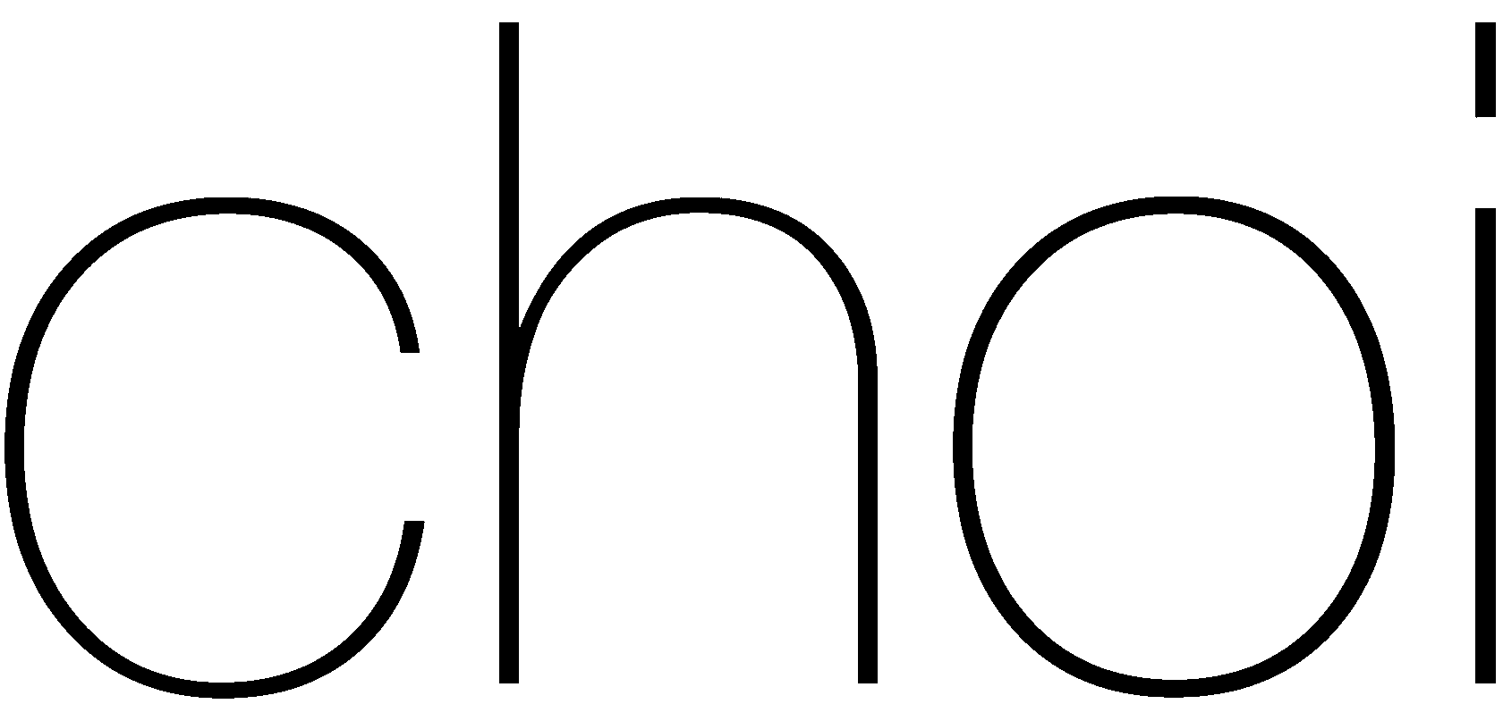
The task was to create a logo for the CHOI brand suitable for the following aspects:
1. Minimalistic form
2. Possible Asian accent
3. Practical for incorporation into clothing design, accessories in the form of zippers, independent design, etc
4. Target audience is mass segment, which appreciates quality and design
5. The name of the brand should be in the form of regular text
6. The color for the logo is red + black



01
02
03
04
05
07
06
08
10
09




When creating a visual solution for something, I first do a research where I explore my reference libraries + do some additional image research, then I start drawing a shape based on my results
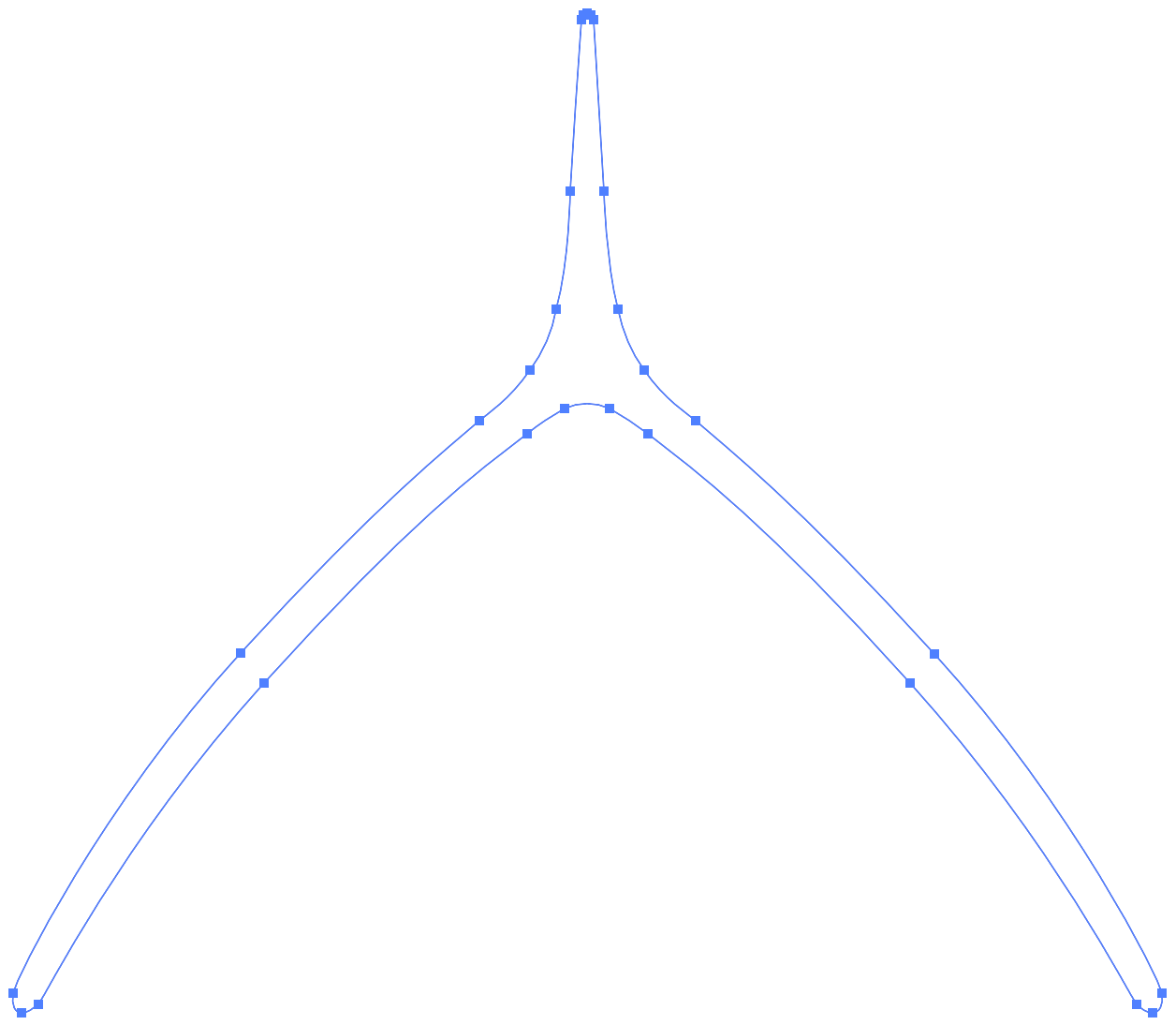
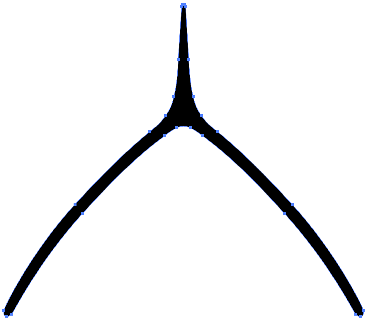
In the process of creating the shape, I iteratively reached a geometry that reminds of wishbone, and reinterpreted it a bit so that the logo has authenticity but still maintains an overall recognizability. For me, this was the perfect result for the tasks assigned to this logo. This shape that is associated with cultural symbolism, but has already become ingrained in the minds of masses, so it will be easy to recognize for the brand's target audience. And also the shape maintains the abstract undertones and simplicity of the geometry
In the process of creating the shape, I iteratively reached a geometry that reminds of wishbone, and reinterpreted it a bit so that the logo has authenticity but still maintains an overall recognizability. For me, this was the perfect result for the tasks assigned to this logo. This shape that is associated with cultural symbolism, but has already become ingrained in the minds of masses, so it will be easy to recognize for the brand's target audience. And also the shape maintains the abstract undertones and simplicity of the geometry
01
/23
10
01
/23
10
Credits:
Art Direction & Logo: Tonya Drozdova
Art Direction & Logo: Tonya Drozdova
Oct 2022
Client: Choi
Client: Choi