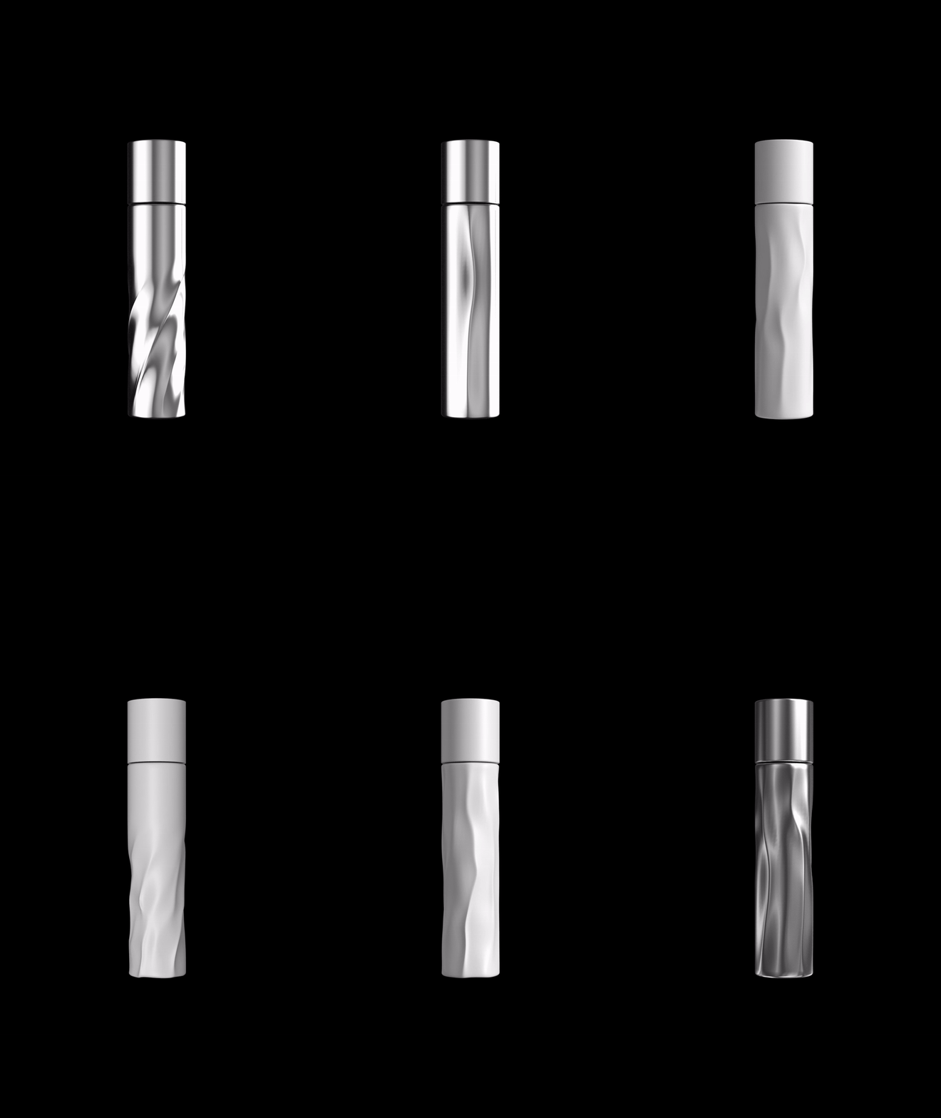
017 / LAINE / WIP
ART DIRECTION / PACKAGING DESIGN / LOGO
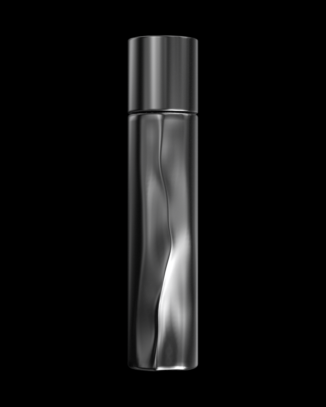
P1S02
/23
11
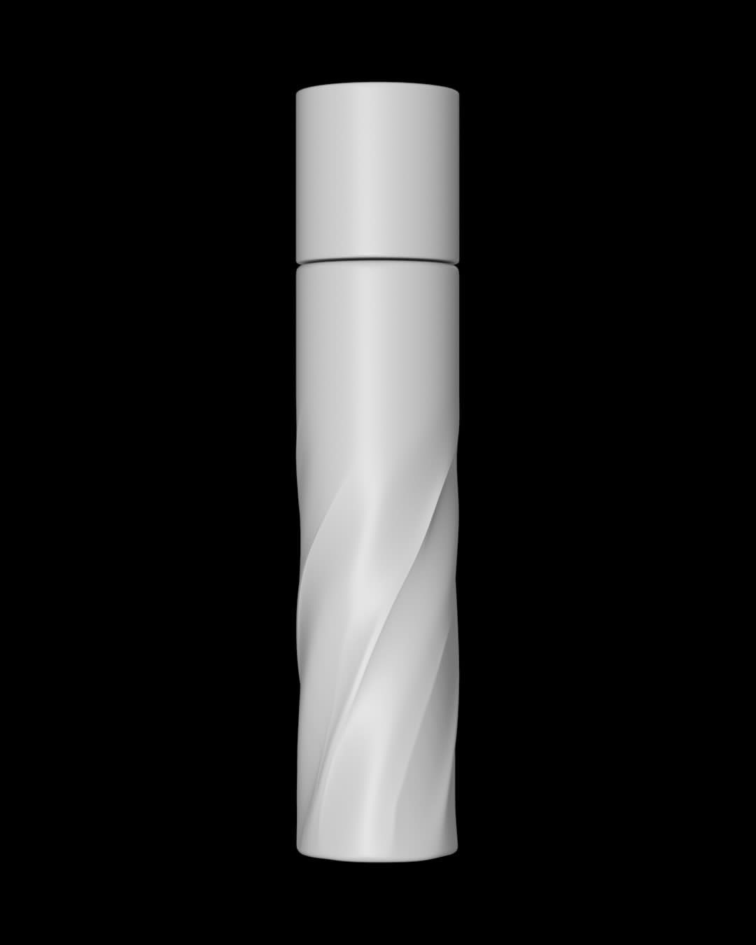
P1S03
/23
11
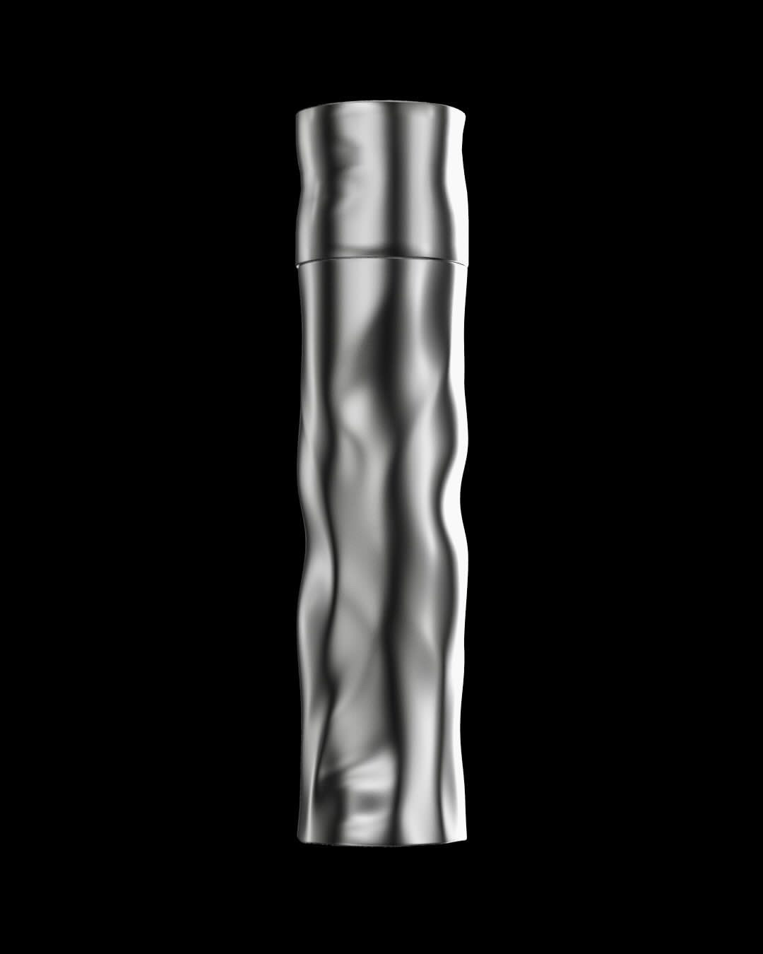
P1S04
/23
11
P1S05
/23
11
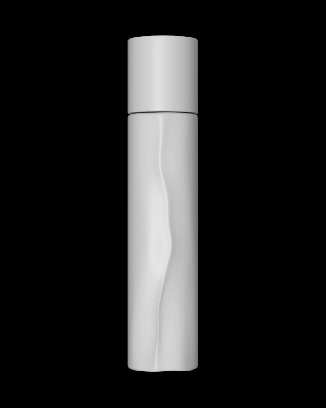
The first task was to create a unique design for the packaging that would stand out in style from the rest and also be eco-friendly
The founder of the brand gave me complete freedom to create the design. I did a lot of research to understand how other brands think to design their packaging, so that based on what exists, I could define for myself criteria for combinations of techniques that are not found in the thinking of others, to find the right form faster
In order to create a design that not only helps the brand stand out from the rest, I also paid attention to the concept so that it reflects the brand itself
The idea for it came from the pronunciation of the brand name LAINE itself. The first association when pronouncing it for me is the shape of a line, and the name itself is like a more authentic and abstract version of that. Imagining the shape of the line also perfectly complemented the specifics of the brand, and the perception about it provides an abundance for possibilities in interpretation
The brand founder sent the design to manufacturing and the resulting total cost became unsustainable for the first product launch. So the next step was to come up with a new design, but already for the purchased forms of packaging
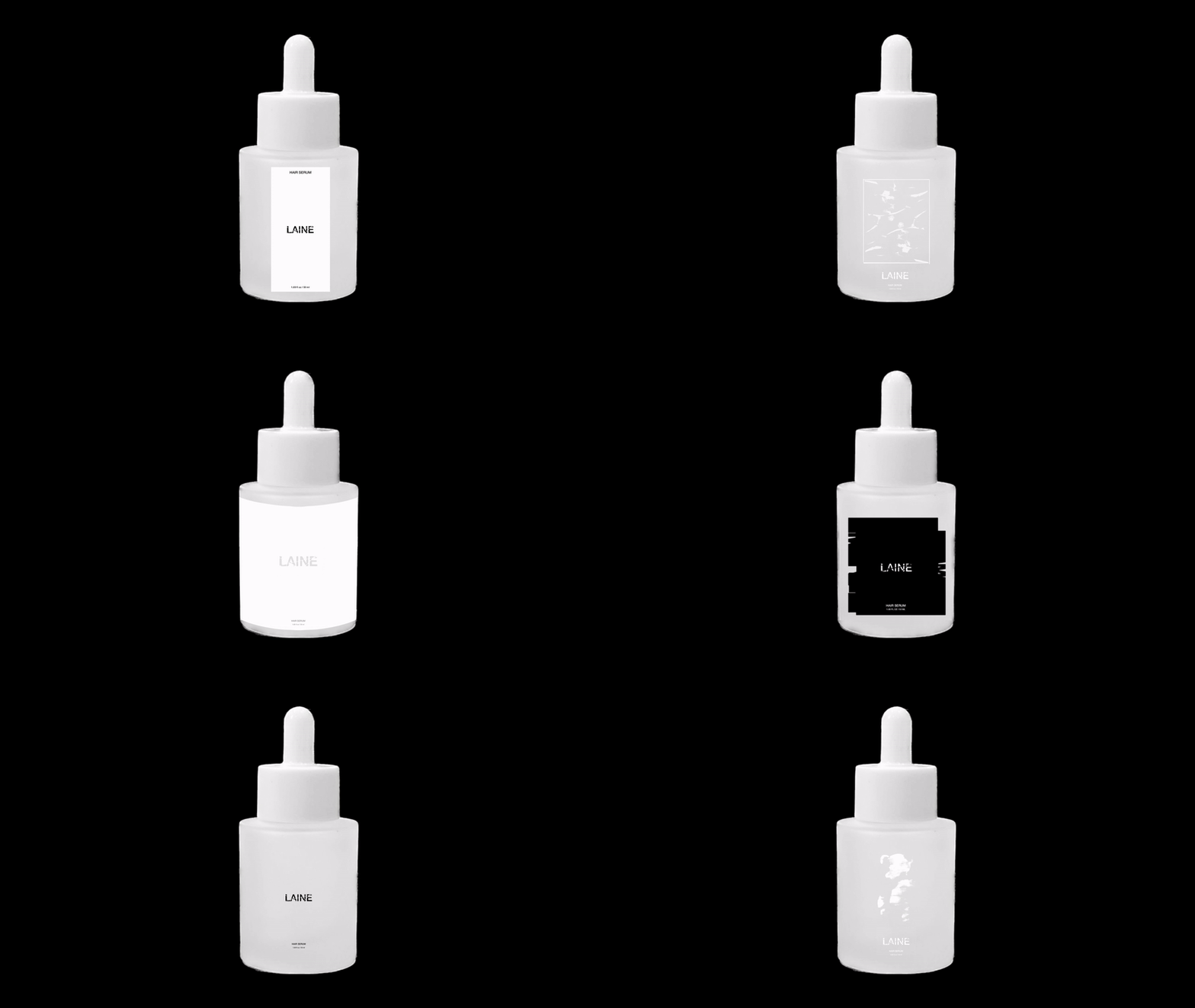
017 / LAINE / P2 / LABEL DESIGN
To keep to the original success metrics for this project, I did a second extensive study specifically focused on label design. While discussing the intermediate results of the work, the brand founder and I came to the conclusion that the 1st design would be best made more introductory. Since the brand didn't have a logo at the time, I came up with the idea to synchronize the concept of the lines and the logo itself, so that the packaging design could be both authentic and introductory
017 / LAINE / P3 / LOGO
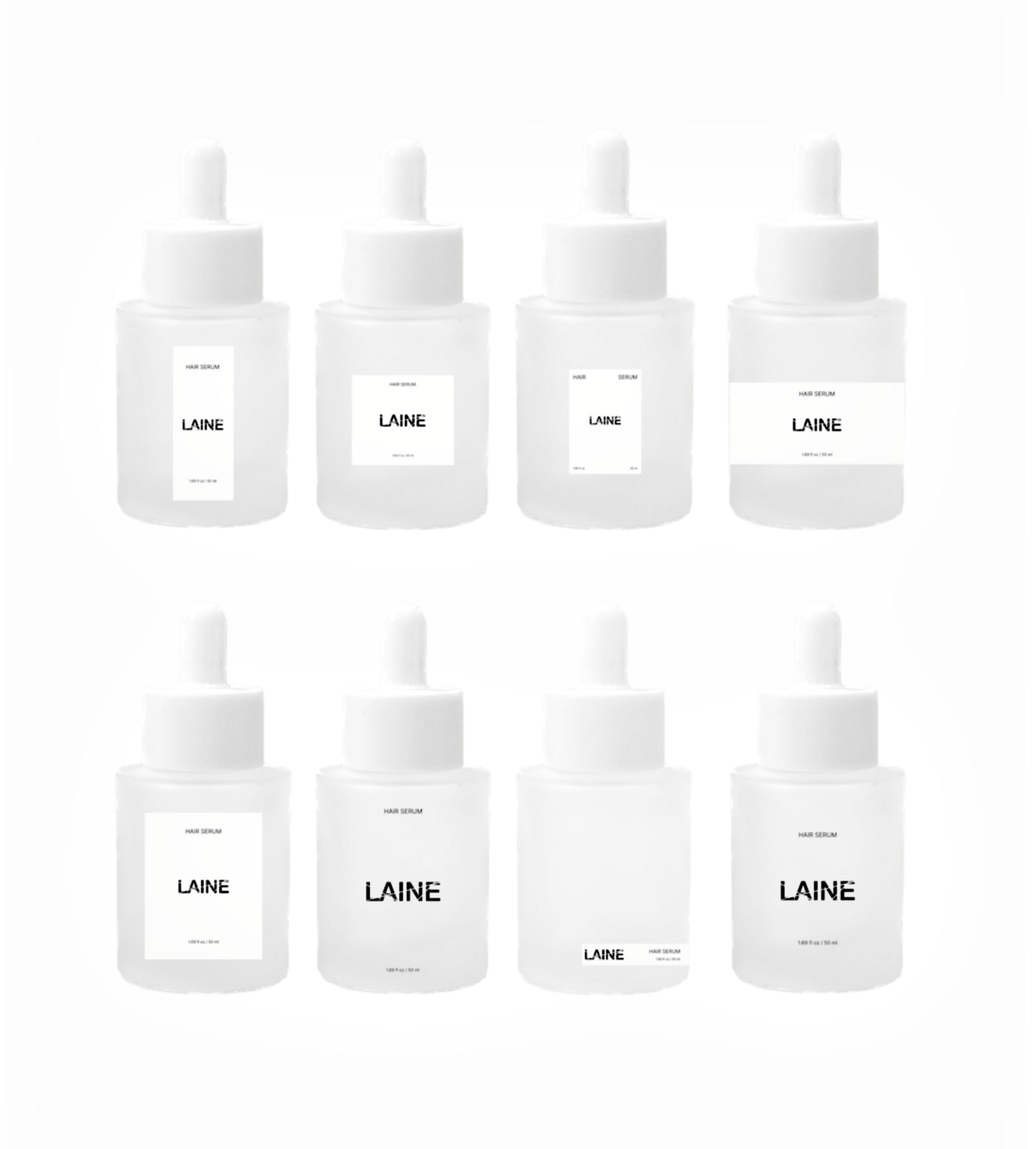
When creating the logo, additional research was also done + many options were developed so that the brand founder would have a better opportunity to understand what resonated more. Some of the variants are presented below, the choice was made in favor of the 4th option

01


03

04
02

Credits:
Design & Art Direction: Tonya Drozdova
Design & Art Direction: Tonya Drozdova
Client: LAINE
Dec 2023
Dec 2023